
“The Cover Uncovered” will be a monthly post where I dissect the cover of a relatively recent book and take a look at what works, what doesn’t, and what you can learn from it.
Every month, we here at Unstressed Syllables are given a literary genre to loosely focus on in our work for that month. And, to be honest, this month’s–chick lit–isn’t really my cup of tea. Part of the reason for this, I think, is that the book covers of this genre just don’t draw me. The high-heels of The Devil Wears Prada or Bond Girl variety, curly writing and pink of Confessions of a Shopaholic, or the wistful photos and simple typography of a Nicholas Sparks novel might as well be advertising a book in a foreign language. Actually, I might pick up a foreign language book, so that’s a poor comparison. When I see a pink book cover, something just reaches into my curious mind and finds the “off” switch.
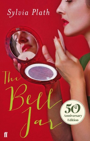 (I would never pick up Sylvia Plath’s “The Bell Jar” if this was the only cover for it)
So how to analyze a cover of a genre who’s graphical elements I have no personal interest in? After all, what’s uninteresting to me is obviously attracting other women and allowing these books to become bestsellers. It’s a bit of a trick question, actually. The principles of design still hold, whether it’s a hated genre or a beacon of light and perfection among other genres.
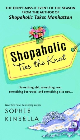
This week’s cover comes from my sparse knowledge of popular chick-lit: The Shopoholic Series. Whatever else might be wrong, you can argue that this series offers a bright and colorful companion for your vacation on the beach. For simplicity’s sake, I’m just choosing to focus on this one:
Color, Background & Graphical Elements:
Bright yellow on a light blue background makes the cover seem cheery and fun to read. Even if there is drama within, you know it’ll be resolved happily at the end. With everything bright, the black text stands out against it. The watercolor illustrations on the cover also compliment the colors, adding more of that cheery “everything is fun and happy” feel. I am a little confused why the bouquet of flowers is hovering on the price tag, since there’s wedding jewelry and a wedding dress train below. It did take me several minutes to figure out that blue blob was a wedding dress train, so maybe the designer wanted to drive home the “wedding” aspect. Overall, I would say the graphical elements and their layout is inefficient at best.
Typography:
There is a lot of typography going on here, and not the good kind. See, a big part of putting together a good design is to make sure the over-all look is consistent. And nothing will mess with consistency more than having too many fonts on your cover.
Take a quick moment to count the number of fonts on this book cover (I even made it larger than normal to help you).
Done?
I count at least 6 different fonts: two in the title, one in the “the don’t miss event…”, one in the tagline, one in the author’s name, and I believe two in the “New York Times bestselling,” but the text is pretty small so I can’t really tell. The result makes the cover seem disheveled and not unified. It’s as if the designer put together the title and illustration , then someone else decided to add the author’s name but didn’t know what typeface to use and guessed, then someone else added the tagline, and so on.
Hence one of the most important rules to keep a book cover from looking amateurish:
Keep font use limited. Rule of thumb is two fonts (one fancy and one basic)**. Three only if you absolutely have a good reason for it (for example, you have a logo that incorporates a different font).
If you keep to that rule, it’ll automatically improve the quality of your book cover in 99% of cases.
All in all, the covers of all the Shopoholic books covey a light, fun read rather well through its color use. The graphical elements and typography, however, suggest a messiness that should have been tightened for a more efficient and eye-catching cover. Inconsistency and messiness in a cover means the potential reader has to work just that much harder to figure out what the book cover says. Often times, that one little second of extra work means a lost sale and another potential reader gone.
**It’s important to note for the above rule, that things such as italics and bold don’t count as a different font. Even though it looks different, they still belong to the same type family and so will still feel consistent.


