
When you see a book, a photo, or a webpage, your eyes seem to instantly see it all. In reality, there’s always something you look at first before moving onto the next object a millisecond later. Often our eyes start at the top left corner of the page because, through multiple millennia, we’ve trained most of the world by always reading pages from left to right. That natural inclination doesn’t have to be the case. By carefully considering how you place the elements on the page, you can use the human eye against itself. You can make it look, if only for a split second, at what you want: the focal point of your cover.
What should be the focal point of your book cover? As much as you might like to make your title and your name AND your imagery as large as possible, making all three the same size has the opposite effect. Instead of drawing attention to everything, it will make everything blend in with everything else and you’ll end up with a stagnant cover where nothing stands out.
So it’s time to think. What is the most important part of your book cover?
Is it the title? Have you crafted a title so witty and engaging that people will be drawn to it by the words alone?
Is it your name? Will people be attracted to your book by author name alone? This only works if you truly believe with good reason that people:
a) are looking at your book because they’ve read your other work
b) even remember what your name is (I can’t tell you how many books I’ve read and then discovered I had enjoyed other books by the same person)
Is it the imagery? Do you have an excellent, eye-catching illustration that will speak to a potential reader from across the room (or on a side bar of a website?)
Is it extraneous material like a review from a well-known author, a tagline or an award?
Once you’ve decided on the most important part of your book cover, then, in order to make it the star of your cover, you need to consider visual hierarchy. This was touched upon (but not actually mentioned) in this post. I had mentioned how that particular Game of Thrones cover didn’t work because all the elements were the same size–taking up a third of the book. Because of this, the design appeared a bit stagnant*.
So what is visual hierarchy? Simply, it is the order in which a person’s eye perceives the parts of a design, often in a split second. Determining the order which that eye wanders through the design is done by emphasizing the contrast between the objects on the page, through their placement, color, value and size. The object with the most contrast wins the contest and your eye’s momentary attention.
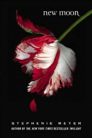
Doesn’t the large white flower really contrast against the background?
*Note: Just because a design has equal three parts doesn’t mean it won’t work. Visual hierarchy relies on other factors like contrast and color to effectively direct a viewer’s gaze.


