
“The Cover Uncovered” will be a monthly post where I dissect the cover of a relatively recent book and take a look at what works, what doesn’t, and what you can learn from it.
Because I like to make life easier for me, I’m zipping right past all the small fish and going straight for the jugular of the current golden-boy of fantasy, the series A Song of Ice and Fire by George R.R. Martin. I had apparently read the mind of my editor, because her exact words in the email detailing my assignment were, “Seriously, gold with a lion? I never wanted to read Game of Thrones based on the cover.”
By now, if you haven’t seen this particular cover, you are maybe mildly curious. I present:
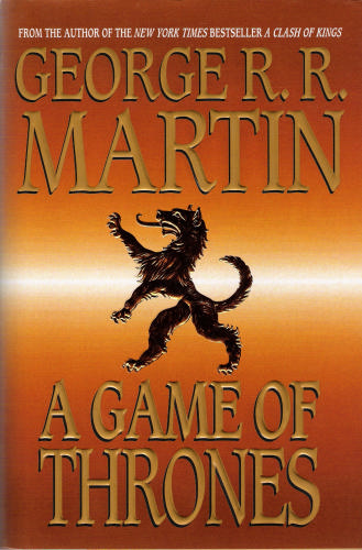
Thank goodness this was not the first edition, or who knows what tv show HBO would have created in its place.
Let’s first start out with a compliment: the rest of the books in the series follow the same template. At least you’ll know the books are all from the same series, even if you have no desire to pick the books up because they’re so ugly.
Color & Background:
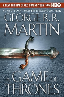
The gradient that pervades all the books of this series’ edition is stark (no pun intended) and horrible. Gradients have their place, such as in webdesign, but the subtler the gradient, the more effective it can be at drawing attention to where you want the reader to look. Also, you see the lines of color as it shifts from gold to white to gold again? That’s called “banding,” and it’s considered unprofessional from a design perspective. For a better example of gradient use, scroll to the edition at the bottom of the page.
As for the actual color chosen, it works since the book features kings, and kings often like shiny things like gold. Not exactly subtle, but it works. What doesn’t work is the gold lettering on top of the shades of gold background. It impacts readability, which leads us to…
Typography
A title in one shade of gold is hard to read against a gold background. To his or her credit, the designer picked a legible typeface, that is, it’s easy to distinguish individual letters.
Notice how author’s name consumes a third of the cover. In contrast to this, the book title is small. That gets to happen when your name holds a great amount of branding potential. People start buying your books because you wrote them (which actually can explain some of what happened with this disaster of a book cover). Let us all cross our fingers and work hard so that we can take advantage of this at some point in our life. However, the fact the author’s name is so big actually works against it, as seen in the…
Composition and Graphical Elements
Composition is the way in which pieces are combined and arranged to visually tell a story. Proper composition considers factors such as alignment, grouping, placement, space, and visual flow. But that’s several blog posts for another time. The main thing to take from this cover is that the composition is stagnant. Yes, it follows the Rule of Thirds , but with everything centered and then split evenly between the three elements of AUTHOR NAME, LION SYMBOL, BOOK TITLE, it makes for a visually boring cover.
Now, look at the cover again. Close your eyes. Now open them and note the first thing your eye is drawn to. In fact, I suspect the purpose of the already mentioned loathsome gradient is to pull your eye to it. A simple black heraldic lion. The purpose, symbolizing the House of Lannister, is as plain as the lion which adorns it. I’m not exactly knocking the symbol. It very well might work marvelously on a different GoT cover. However, when placed upon the shiny, distracting background, it comes off as boring.
Hopefully this post gave you small bits of the different parts to a complete, good book cover design. It’s important not to neglect them, or your entire cover could suffer. Meanwhile, it appears that a designer took the problems I have with this cover and fixed them in a newer edition: giving us a marginally more interesting and eye-catching cover. Create a good cover, and that’s half the battle.
Rachel Giles is a professional graphic designer who graciously donates her time to the Consortium. Every Tuesday she shares an article about quality cover design.


[…] is dead on when she says creating a good cover is half the battle of hooking a new reader. The back cover copy is definitely the other […]